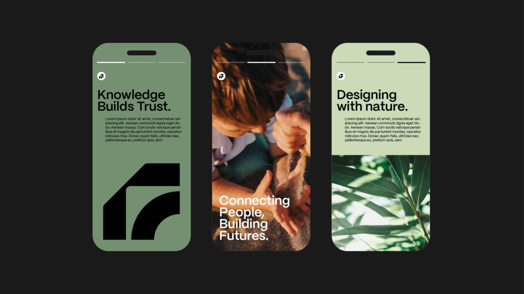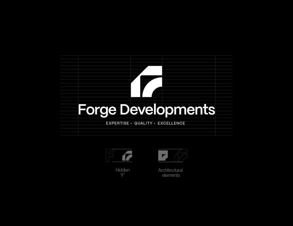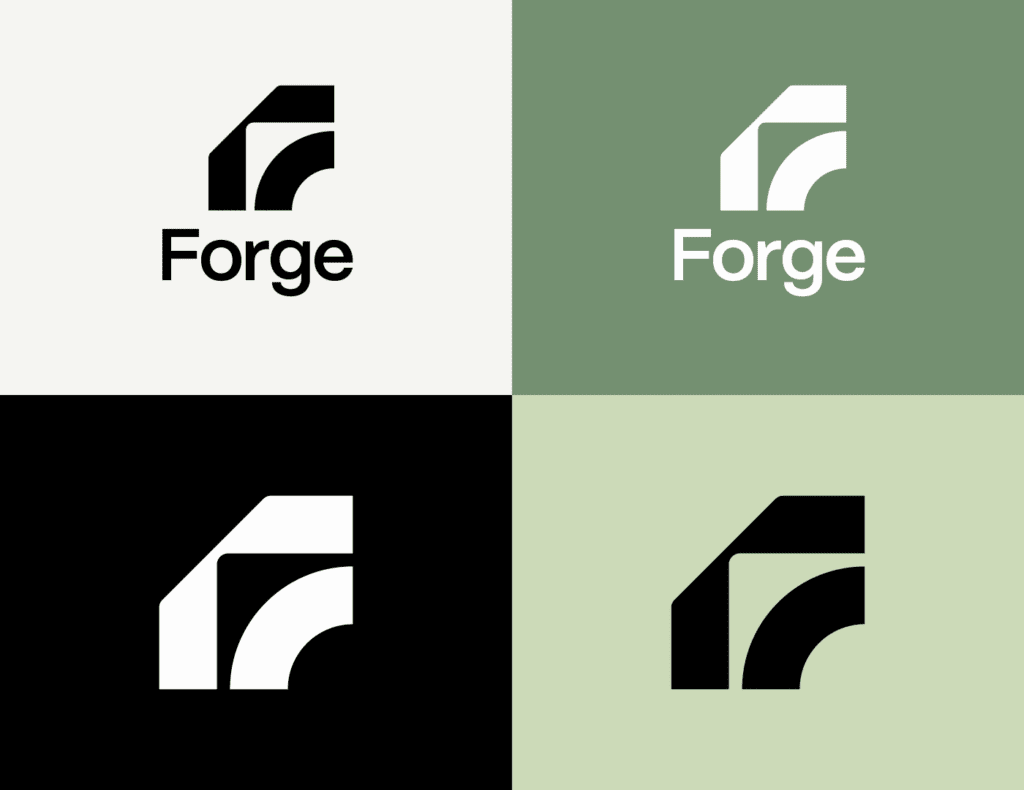
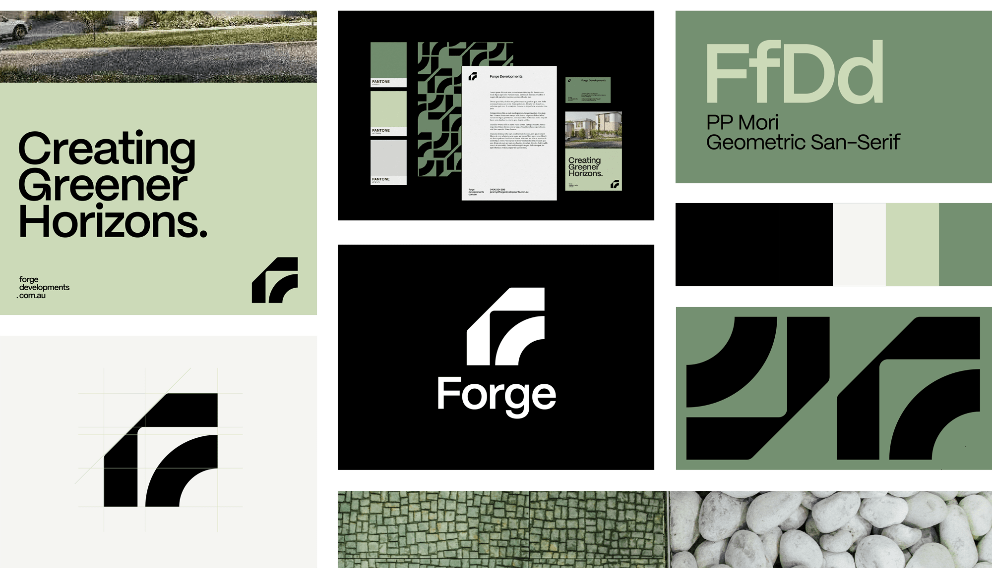
We built a brand around a geometric F—strong, precise, forward-moving. The vertical forms signal stability and architectural rigour, while the soft radius adds connection and momentum. Minimal by design, the mark is instantly recognisable and scales cleanly from documents to site hoardings and digital touchpoints.
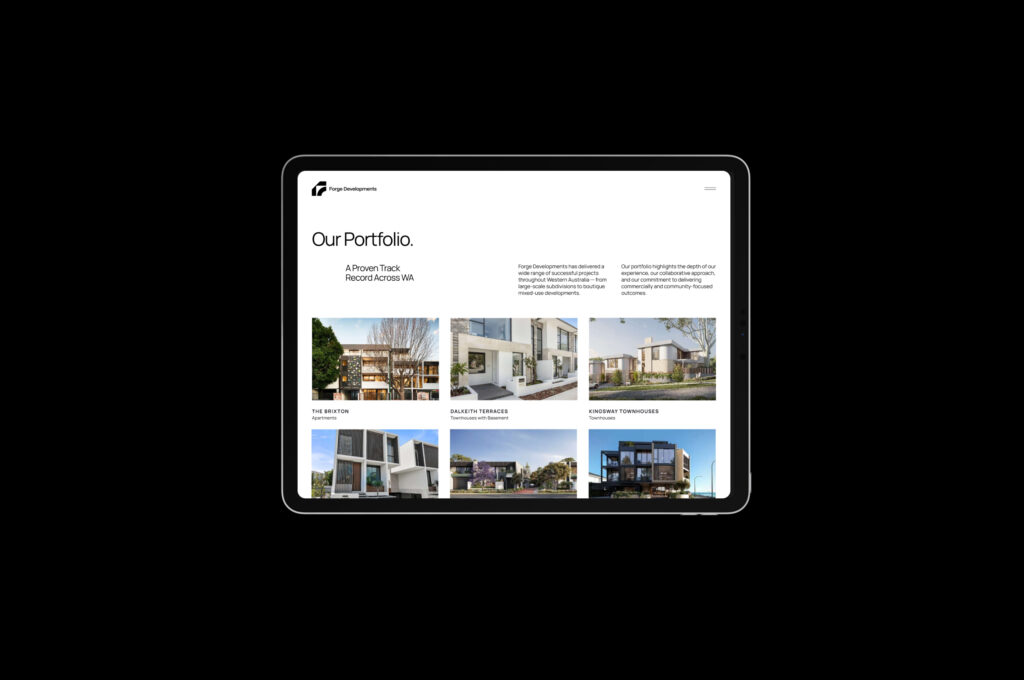
Alongside the identity, we delivered an SEO-optimised WordPress site for Forge Developments—fast, secure and conversion-ready—designed by Pip N Pop and built with Riaz (Diginomic).
Services
Identity
Brand Guidelines
Print Collateral
UI and UX